
Local Christian Marketplace. Search our directory of local Christian owned businesses.
Boco [bo-co]:{adjective} Boco is a catchprase. An acronym to be more exact. It is a philosophy and a movement. It stands for Buy Only Christian Owned, but it means many things.
Don't see your business?


Home > Ignite
iBoco Ignite:
the marketing platform for businesses
Since we posted last week about how claiming your business profile on directories will have a direct impact on your pagerank, it seems appropriate to share a great infographic about making sure your site looks the part when you get all that new traffic.
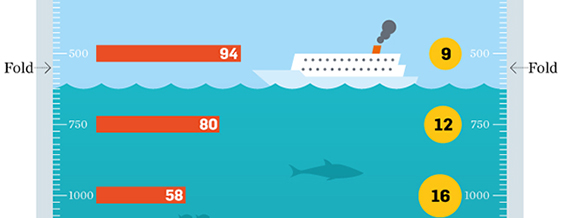
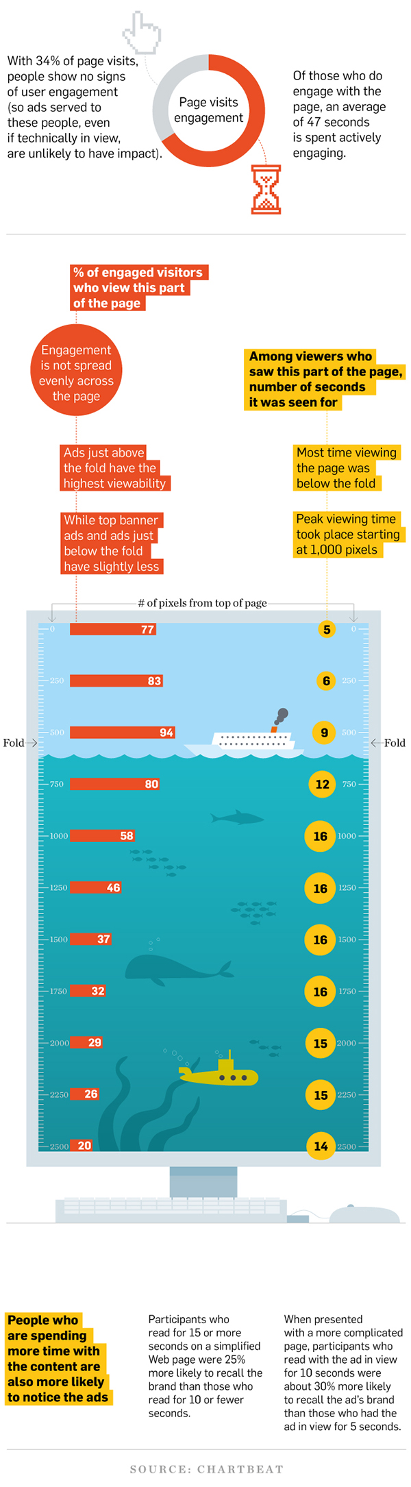
Chartbeat studied the behavior of 25 million users web-wide and gathered their discoveries into the infographic below, which shows where the most visitors spend the most time on a webpage. (The graphic also features a yellow submarine, so it’s pretty much a winner in my personal book.)
A few key insights to look for:
Website Layout Tips: Where should the important stuff go on your site?
66% of visitors to a website show some form of engagement. Additionally, these users spend an average of 47 seconds actively engaging on your site.
The percentage of engaged visitors (shown by the red bars) increases from 0 pixels to 500 pixels down the page, and then decreases steadily after that. So the best chance for engagement is right above the “fold” of the website. (Where you’d have to scroll down to see more.)
The number of seconds spent on a particular part of the page, however (shown by the yellow dots), steadily increases up to 1750 pixels from the top, and then drops off only slightly below that. This means that while you may have more engaged people interacting above the fold, those that do scroll down will spend more time engaging with the content.
What’s the moral lesson for your website layout? Make a list of the elements and messages on your website and organize them into Must See, Would Be Nice To See, and Bonuses (or whatever categories you like). Put the Must See items just above the fold – or 500 pixel mark. Put the next most important things, those that you want people to spend more time with, a little further down. Finally, toward the bottom of the page you can include the extras that not everyone needs to see. Things like your copyright, contact details, employment, etc. will be found either way by the people who are engaged enough to look for them.
Without further ado, I present to you the Chartbeat infographic!

iBoco Weekly
Newsletter
Download
Center
About Rob
Rob Taormina is a digital marketing strategist and founder of iBoco & Big Purple Button Media. He helps entrepreneurs across industries establish strategies to maximize the power of digital media and increase the success of their online marketing efforts.

posted by:
Rob Taormina
keywords: website layout tips, infographics, website design